Marketing Adapters
Marketing Adapters is an internal dashboard for monitoring campaign breaches, rules, and interactions.
Tools Used

Product Overview
Marketing Adapters is an internal tool used to monitor breaches, manage rules, track interactions, and configure notification settings for marketing campaigns. Originally built by engineers for engineers, the tool was highly functional but lacked user centered design.
I was tasked with modernizing the interface while preserving its core functionality. This redesign was a focused but meaningful effort to improve usability, introduce visual clarity, and align the tool with our design system. Making it more accessible for everyday users and scalable for future compliance needs.
Jan. 2025 - May 2025
Marketing Adapters
Product Designer
The Problem
The existing dashboard was effective but outdated. It had not yet been rebuilt within our design system, and its interface lacked consistency, clarity, and intuitive interaction patterns. Users struggled with visual overload and unclear flows, especially when managing breaches and rules.
Goals
Rebuild the Marketing Adapters dashboard using our design system for consistency and scalability
Modernize the interface to improve clarity and usability across breach tracking, rule management, and comment flows
Ensure the tool remains functional for technical users while becoming more intuitive for broader internal audiences
Document flows and interactions to support future iterations and compliance alignment
Design Process
Exploration
I conducted a full audit of the existing interface, including breach cards, rule drawers, record views, and comment sections. The primary issues were visual inconsistency, lack of hierarchy, and absence of design system components.
This review helped identify which elements needed redesign, which flows required simplification, and where user experience could be improved without disrupting core functionality.
Iteration
I introduced updates aligned with our design system to improve clarity and consistency:
Card redesign
Rule drawer updates
Record details modal
Add Comment section
Each update was designed to preserve technical depth while improving usability and visual hierarchy.
Final Design
A modernized card grid with color-coded breach indicators
Consistent drawer components for rules and records, with clearly defined actions
Redesigned comment sections for both admin and user roles
Documented flows and interaction patterns for future reference and onboarding
Full alignment with the design system to support scalability and cross-tool consistency
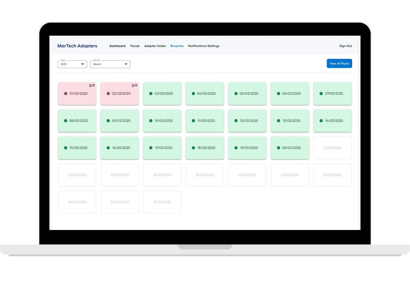
This screen introduces a calendar based interface for tracking Breaches. Color-coded dates help users distinguish between Breaches (red), approved (green), and upcoming (white).
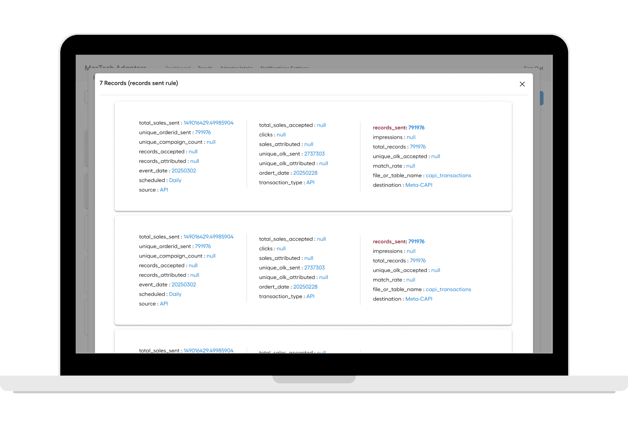

This screen expands on rule execution details, listing multiple entries with status indicators and links to additional information. The design ensures that even complex logs remain navigable and actionable.


This screen expands on rule execution details, listing multiple entries with status indicators and links to additional information. The design ensures that even complex logs remain navigable and actionable.
Reflections
This redesign underscored the importance of cross functional collaboration. Working within Salesforce’s limitations required creative problem solving and close alignment with Internal Communications.
The process also highlighted how small structural changes, like grouping by urgency or adding a teaser tile can significantly improve engagement and usability.
Results
The redesign delivered a cleaner, more intuitive interface while maintaining all existing functionality. Although the tool is still in development, early feedback has been positive, especially around clarity and ease of use.
Future enhancements will focus on expanding Forum content types, improving personalization, and refining interactions based on user feedback.
Marketing Adapters
Marketing Adapters is an internal dashboard for monitoring campaign breaches, rules, and interactions.
Tools Used
Marketing Adapters
Marketing Adapters is an internal dashboard for monitoring campaign breaches, rules, and interactions.
Tools Used

Product Overview
Marketing Adapters is an internal tool used to monitor breaches, manage rules, track interactions, and configure notification settings for marketing campaigns. Originally built by engineers for engineers, the tool was highly functional but lacked user centered design.
I was tasked with modernizing the interface while preserving its core functionality. This redesign was a focused but meaningful effort to improve usability, introduce visual clarity, and align the tool with our design system. Making it more accessible for everyday users and scalable for future compliance needs.
Jan. 2025 - May 2025
Marketing Adapters
Product Designer
The Problem
The existing dashboard was effective but outdated. It had not yet been rebuilt within our design system, and its interface lacked consistency, clarity, and intuitive interaction patterns. Users struggled with visual overload and unclear flows, especially when managing breaches and rules.
Goals
Rebuild the Marketing Adapters dashboard using our design system for consistency and scalability
Modernize the interface to improve clarity and usability across breach tracking, rule management, and comment flows
Ensure the tool remains functional for technical users while becoming more intuitive for broader internal audiences
Document flows and interactions to support future iterations and compliance alignment
Design Process
Exploration
I conducted a full audit of the existing interface, including breach cards, rule drawers, record views, and comment sections. The primary issues were visual inconsistency, lack of hierarchy, and absence of design system components.
This review helped identify which elements needed redesign, which flows required simplification, and where user experience could be improved without disrupting core functionality.
Iteration
I introduced updates aligned with our design system to improve clarity and consistency:
Card redesign
Rule drawer updates
Record details modal
Add Comment section
Each update was designed to preserve technical depth while improving usability and visual hierarchy.
Final Design
A modernized card grid with color-coded breach indicators
Consistent drawer components for rules and records, with clearly defined actions
Redesigned comment sections for both admin and user roles
Documented flows and interaction patterns for future reference and onboarding
Full alignment with the design system to support scalability and cross-tool consistency
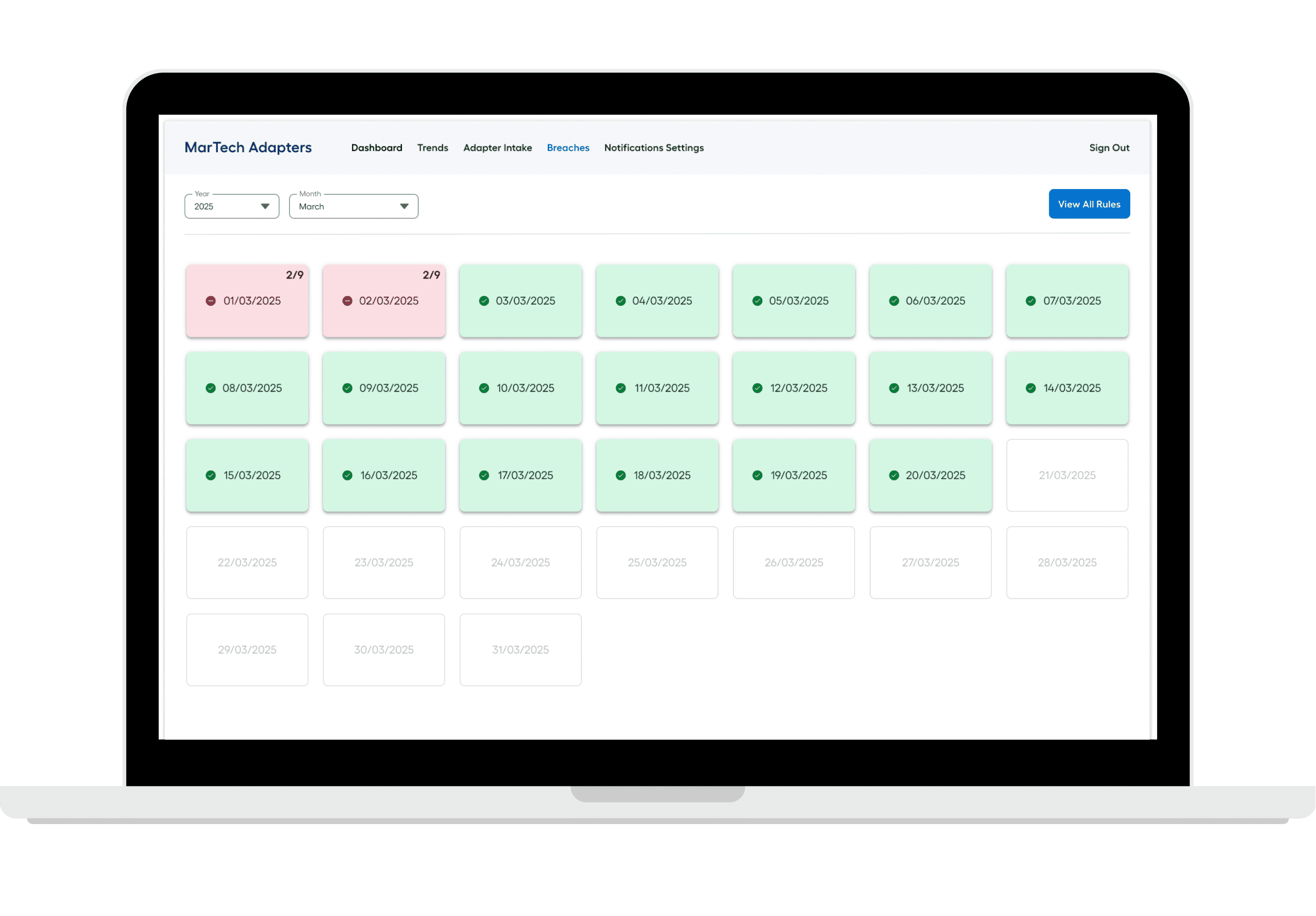
This screen introduces a calendar based interface for tracking Breaches. Color-coded dates help users distinguish between Breaches (red), approved (green), and upcoming (white).
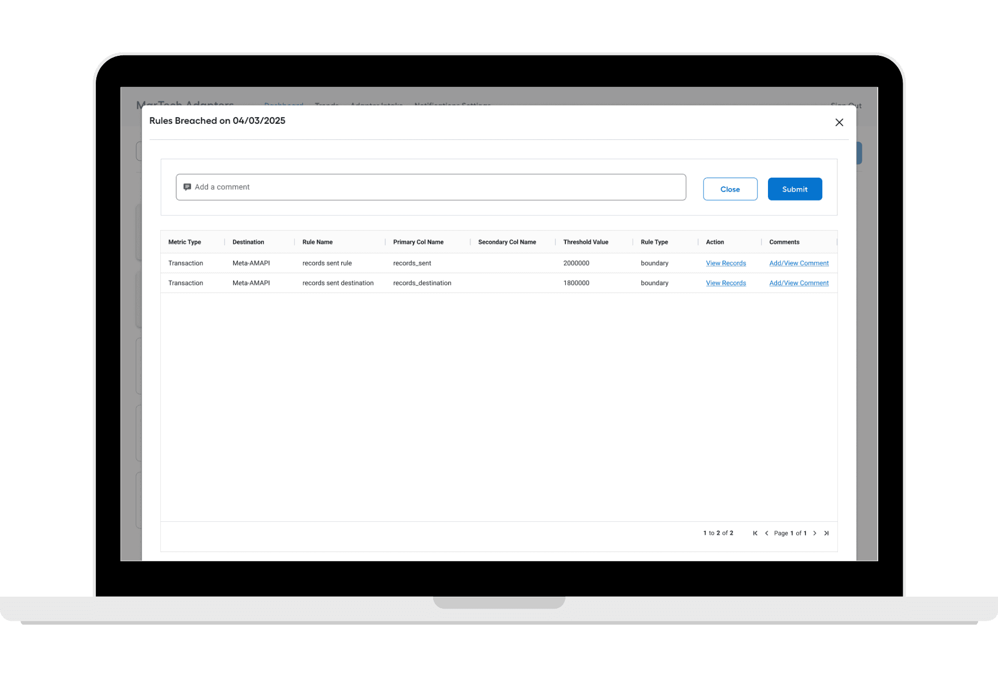

This view surfaces executed rules for a specific date, offering a structured table where you can add or view comments, and view records. The layout emphasizes operational clarity, enabling both technical users and compliance leads to monitor execution history and follow up on rule ownership or anomalies.

This screen expands on rule execution details, listing multiple entries with status indicators and links to additional information. The design ensures that even complex logs remain navigable and actionable.
Reflections
This was my first solo design project and the first time I formally documented interaction flows. It taught me the value of clear documentation, thoughtful collaboration with engineers, and designing for both immediate usability and long-term scalability.
It also reinforced the importance of balancing technical depth with user-centered design especially in tools built for operational monitoring and compliance.
Results
The redesign delivered a cleaner, more intuitive interface while maintaining all existing functionality. Although the tool is still in development, early feedback has been positive, especially around clarity and ease of use.
Future enhancements will focus on expanding Forum content types, improving personalization, and refining interactions based on user feedback.
My Projects
Cameron McKalvey


Product Overview
Marketing Adapters is an internal tool used to monitor breaches, manage rules, track interactions, and configure notification settings for marketing campaigns. Originally built by engineers for engineers, the tool was highly functional but lacked user centered design.
I was tasked with modernizing the interface while preserving its core functionality. This redesign was a focused but meaningful effort to improve usability, introduce visual clarity, and align the tool with our design system. Making it more accessible for everyday users and scalable for future compliance needs.
Jan. 2025 - May 2025
Marketing Adapters
Product Designer
The Problem
The existing dashboard was effective but outdated. It had not yet been rebuilt within our design system, and its interface lacked consistency, clarity, and intuitive interaction patterns. Users struggled with visual overload and unclear flows, especially when managing breaches and rules.
Goals
Rebuild the Marketing Adapters dashboard using our design system for consistency and scalability
Modernize the interface to improve clarity and usability across breach tracking, rule management, and comment flows
Ensure the tool remains functional for technical users while becoming more intuitive for broader internal audiences
Document flows and interactions to support future iterations and compliance alignment
Design Process
Exploration
I conducted a full audit of the existing interface, including breach cards, rule drawers, record views, and comment sections. The primary issues were visual inconsistency, lack of hierarchy, and absence of design system components.
This review helped identify which elements needed redesign, which flows required simplification, and where user experience could be improved without disrupting core functionality.
Iteration
I introduced updates aligned with our design system to improve clarity and consistency:
Card redesign
Rule drawer updates
Record details modal
Add Comment section
Each update was designed to preserve technical depth while improving usability and visual hierarchy.
Final Design
A modernized card grid with color-coded breach indicators
Consistent drawer components for rules and records, with clearly defined actions
Redesigned comment sections for both admin and user roles
Documented flows and interaction patterns for future reference and onboarding
Full alignment with the design system to support scalability and cross-tool consistency

This screen introduces a calendar based interface for tracking Breaches. Color-coded dates help users distinguish between Breaches (red), approved (green), and upcoming (white).

This view surfaces executed rules for a specific date, offering a structured table where you can add or view comments, and view records. The layout emphasizes operational clarity, enabling both technical users and compliance leads to monitor execution history and follow up on rule ownership or anomalies.

This screen expands on rule execution details, listing multiple entries with status indicators and links to additional information. The design ensures that even complex logs remain navigable and actionable.
Reflections
This was my first solo design project and the first time I formally documented interaction flows. It taught me the value of clear documentation, thoughtful collaboration with engineers, and designing for both immediate usability and long-term scalability.
It also reinforced the importance of balancing technical depth with user-centered design especially in tools built for operational monitoring and compliance.
Results
The redesign delivered a cleaner, more intuitive interface while maintaining all existing functionality. Although the tool is still in development, early feedback has been positive, especially around clarity and ease of use.
Future enhancements will focus on expanding Forum content types, improving personalization, and refining interactions based on user feedback.
Cameron McKalvey


